Choose how you want to learn
Hands-on Biological Data Visualization with ggplot2 & R
Buy this course
One-time purchase of this standalone course.
Continue to course checkout →Included with Annual All Access
This course is included while your Annual All Access membership provides access. This is a recurring subscription.
No free trial is configured for this plan. Review the amount due and renewal terms at checkout.
Compare membership plans →Already purchased? Sign in to access your learning. Review your cart, final price and payment terms before placing an order.
Hands-on Biological Data Visualization with ggplot2 & R
About Course
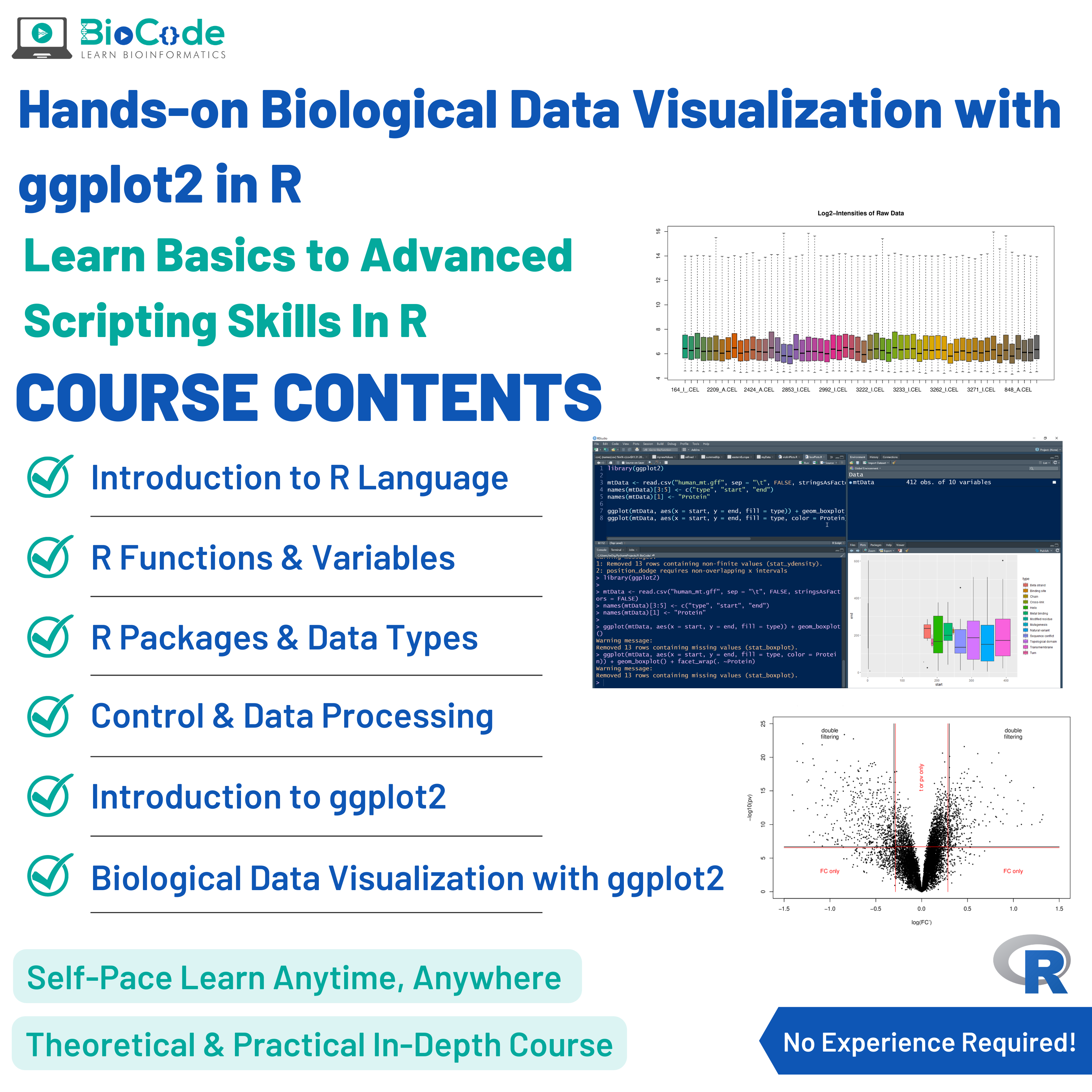
Biological data visualization is an important aspect of bioinformatics which involves the graphical representation of unstructured or structured data to display information hidden in the plots/graphs. The ggplot2 package of R provides various functions to create different graphs and allows modification, annotation, and much more. Learning biological data visualization can not only help you in creating beautiful data visualization but also in making impactful decisions during your research based on data visualizations along with publishable figures for your research papers.
BioCode is offering an advanced biological data visualization with ggplot2 & R course in which you’ll learn how to write customized scripts to generate publication-ready and high-quality graphical plots of biological datasets to visualize, analyze and compare the datasets in a more insightful way, such as volcano plots, heatmap, dot plots, frequency plots, scatter plots, histograms, and bar charts with customized labeling. Even if you don’t know programming or R language at all, in this workshop you’ll learn R language from the basics to the advanced level and then apply your script-writing skills to data visualizations.
Whether you’re a beginner in bioinformatics, an experimental biologist, or a bioinformatics researcher, our course will help you greatly. You’ll be practicing on a case study of human mitochondrial proteome and genome along with a real-world gene expression dataset. Therefore, you’ll not only learn data visualization with ggplot2 in R, but you’ll also do real-world biological data visualization in this biological data visualization with ggplot2 in R workshop.
This course will include the following section:
Section 1: Data Visualization Using ggplot2
Description: This section will focus on making sure that the students learn how biological data is visualized using the ggplot2 package in R language.
Learning Outcomes: Upon completion of this section, students will be able to:
- Explain ggplot2 and its Use in Biological Data Representation.
- Describe Key Components in ggplot2.
- Visualize Human Mitochondrial Proteome.
- Facet the Human Chromosome Dataset.
- Smooth Out the Biological Data.
- Create Box Plot for Human Mitochondrial Proteome.
- Create Histograms for Human Mitochondrial Pattern Finding.
- Create Frequency Plots for Human Mitochondrial Information Frequency Mining.
- Create Bar Charts for Human Mitochondrial Knowledge Mining.
- Scale and Limit Data Visualization.
- Change Labels and Finalize Visualization.
- Visualize a Phylogenetic Tree.
- Save Visualizations in High Resolution.
- Find Differentially Expressed Genes With Volcano Plot Visualization.
Make figures that carry your argument, with ggplot2
A figure is how most people will encounter your result. This course teaches R and ggplot2 from the beginning, across five segments, using biological data throughout — so what you practise on is the kind of data you actually have.
The five segments
- R and installation — getting a working environment, and orienting yourself in RStudio.
- Functions and variables — the language basics, taught only as far as plotting requires.
- Packages and data types — how R stores data, which is where most beginners get stuck.
- Control flow and data pre-processing — reshaping biological data into the form a plot needs. In practice this is most of the work.
- Visualisation with ggplot2 — building plots layer by layer, and controlling every element of their appearance.
Why ggplot2 specifically
ggplot2 implements a grammar of graphics: you declare what maps to what — this variable to the x axis, that one to colour — and the library composes the figure. Once that idea lands, producing an unfamiliar plot type stops being a search for the right function and becomes a matter of describing what you want. It is also the standard in genomics, so most published R figure code you encounter will be ggplot2.
The part people underestimate
Most time spent “making a figure” is spent reshaping data, not plotting it. Counts in the wrong orientation, conditions split across columns that should be rows — this course spends a full segment on that, because it is the actual obstacle.
What you can do afterwards
Take a biological dataset and produce publication-quality figures: expression heatmaps, volcano plots, PCA plots, boxplots with proper statistical annotation — and control colour, scale, labelling and layout well enough to meet a journal’s requirements.
Who it suits
Researchers who currently make figures in Excel or GraphPad and want reproducible ones, students preparing a thesis, and anyone whose plots are fine but take too long to produce. No prior R experience is assumed.
Not ready to enrol?
Get the free syllabus & course updates
We'll email you the full outline for this course plus a starter guide — no spam, unsubscribe anytime.
Tools & technologies you'll use
- R
Course Content
Segment 1: Introduction to R Language & Installation
-
Introduction to R in Bioinformatics & R Installation
09:48 -
The R Studio Interface
06:23 -
Comments
04:17
Segment 2: Introduction to Functions & Variables in R
Segment 3: Introduction to Packages & Data Types in R
Segment 4: Control Flow & Biological Data Pre-processing in R
Segment 5: Biological Data Visualization via ggplot2 in R
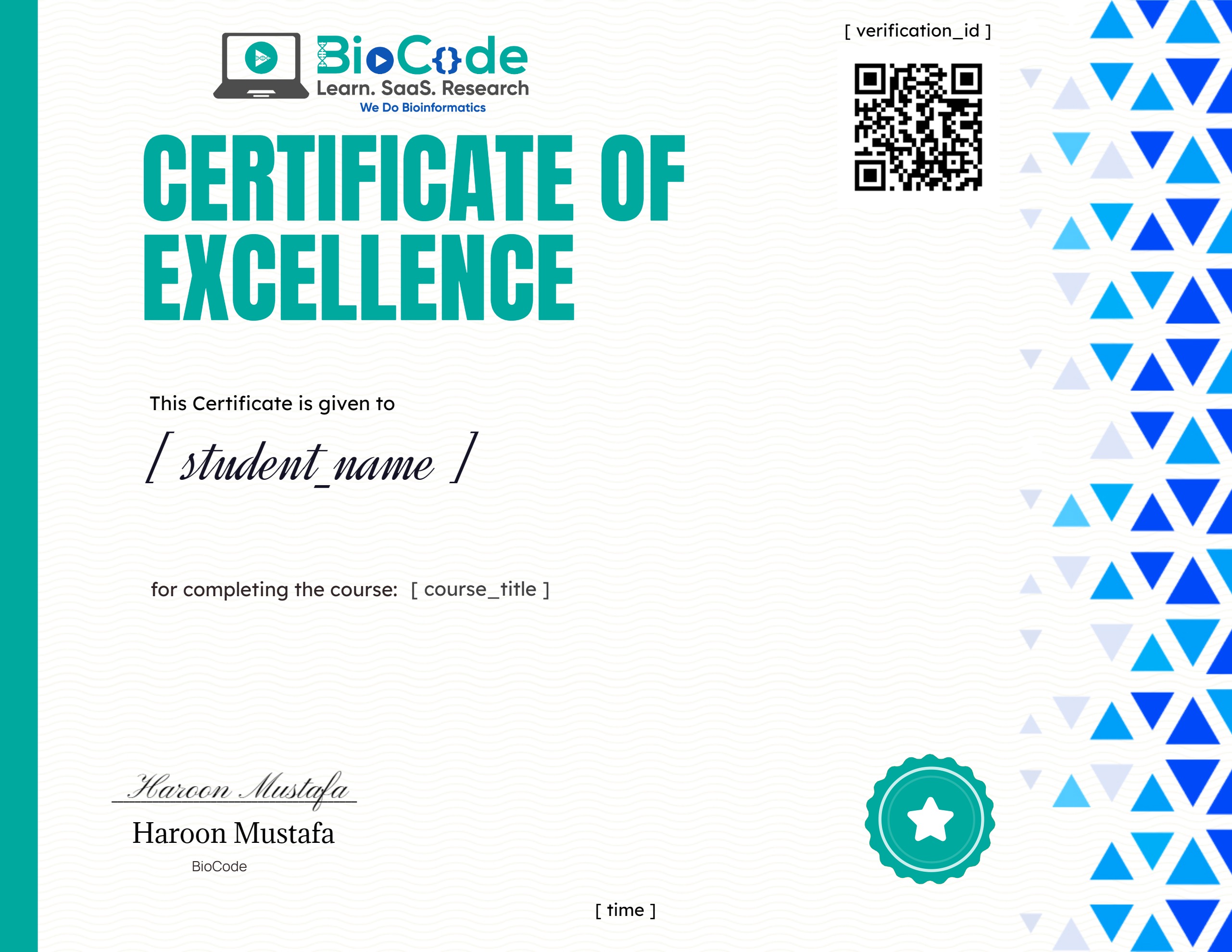
Earn a certificate
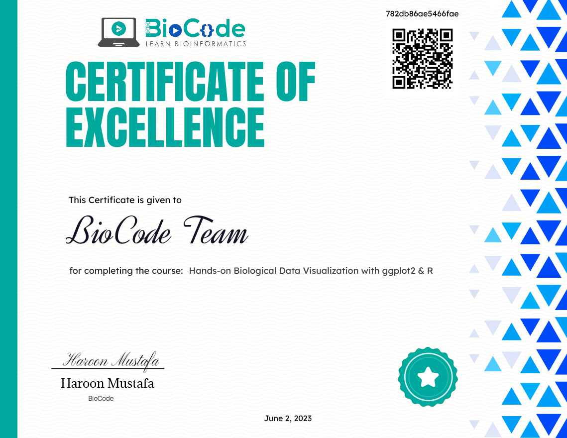
Add this certificate to your resume to demonstrate your skills & increase your chances of getting noticed.
Student Ratings & Reviews
Who this course is for
- Biologists, beginner or intermediate Bioinformaticians or data analysts with no or little experience in applications of computational bioinformatics and bioinformatics pipelines for data visualization.
- Students looking to create publication-ready figures for their research.
What you need to start
- No prior experience in R or coding required
Common questions
Do I need any prior experience for this course?
These are the prerequisites: No prior experience in R or coding required.
How long do I have access after enrolling?
Access is lifetime. Once you enrol you keep the course and any future updates to it, with no recurring fee.
Do I get a certificate?
Yes — you receive a certificate of completion once you finish the course, which you can share on LinkedIn or include in a CV.
Is this course hands-on or theory only?
It is project-based. You work with real research datasets and run the analyses yourself rather than only watching them being explained.