Advanced ggplot2 Biological Data Visualization in R
About Course
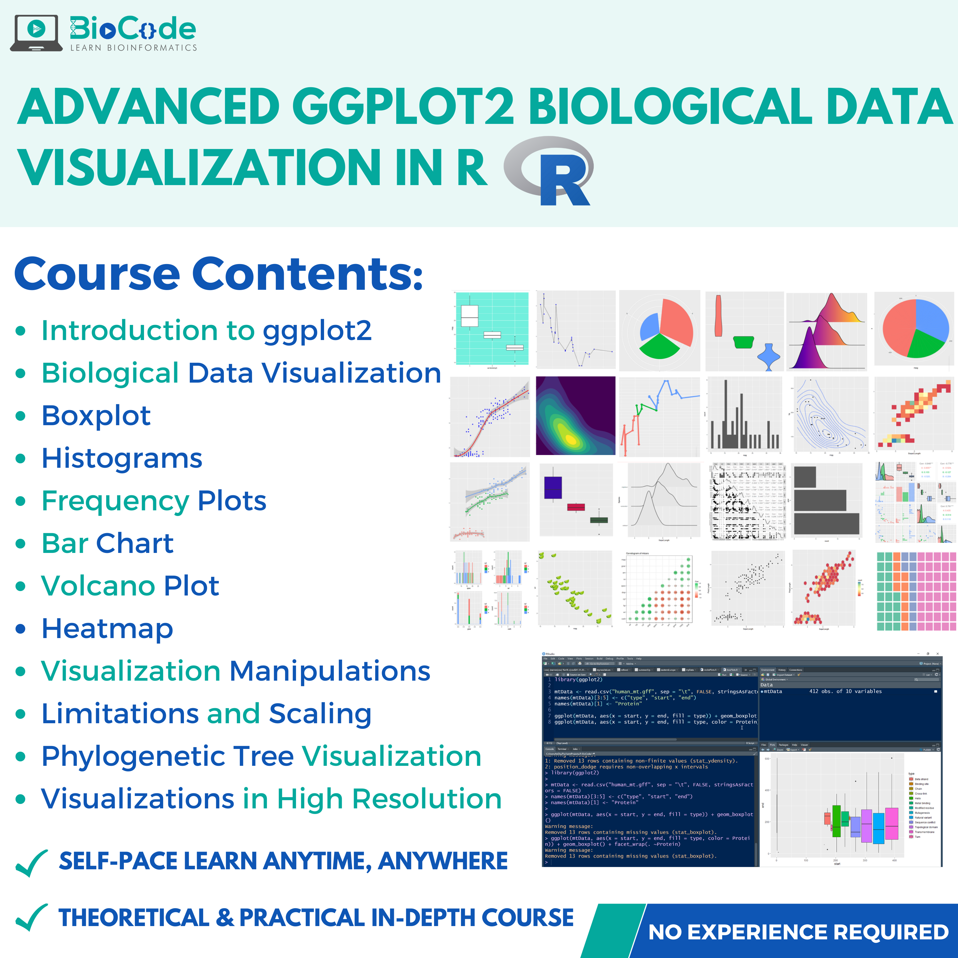
Advanced ggplot2 Biological Data Visualization In R Allows You To Develop Your Data Visualization Skills In R Programming
Data visualization is the process of graphical representation of unstructured or structured data to display information hidden in the plots/graphs. The approach not merely used the visualization tools to present data in the form of graphs but also looking at the world from a graphical point of view.
R provides various packages to analyze biological datasets. The ggplot2 package of R provides various functions to create different graphs, allows modification, annotation and much more.
In this course you’ll learn various concepts to write R scripts and programs to generate publication-ready and high quality graphical plots of biological datasets to visualize, analyze and compare the datasets in a more insightful way.
Joining and learning from the Advanced ggplot2 Biological Data Visualization in R can enhance your biological programming career by learning through various useful & informative pre-recorded lectures on various ggplot2 functions to create interactive plots on biological datasets.
Beyond the basics of ggplot2
This course picks up where introductory ggplot2 teaching stops. It assumes you can already produce a working plot, and concentrates on the control needed to make figures that meet publication standards without hand-editing them afterwards.
What it covers
- Layering and composition — combining geometries deliberately rather than stacking them until it looks right.
- Scales and coordinate systems — transformations, limits and axis control, and how each changes what a reader concludes.
- Faceting — splitting a plot across groups while keeping it readable.
- Themes — taking full control of non-data elements, and building a reusable house style.
- Annotation — labelling points, marking significance and adding statistical annotation cleanly.
- Colour — choosing palettes that survive greyscale printing and remain readable to colour-blind viewers.
Why the details are the work
A default ggplot2 figure is legible; a publication figure is legible at column width, in greyscale, to a reader who has not read your methods. The distance between those is entirely in scales, themes, annotation and colour — the things this course is about. Getting them right in code also means the figure regenerates when your data changes, instead of needing to be rebuilt in Illustrator.
What you can do afterwards
Produce figures that meet journal requirements straight from R, define a consistent visual style across a paper or thesis, and diagnose why a plot is not rendering as you intended rather than working around it.
Who it suits
Researchers already using ggplot2 who find themselves fighting it, students preparing figures for submission, and anyone who currently finishes plots by hand in a graphics editor. Our introductory ggplot2 course covers the foundations if you need them first.
Not ready to enrol?
Get the free syllabus & course updates
We'll email you the full outline for this course plus a starter guide — no spam, unsubscribe anytime.
Tools & technologies you'll use
- R
Course Content
Data Visualization: ggplot2
-
Introduction to ggplot2 for Biological Datasets
10:46 -
ggplot2: Key components
08:26 -
ggplot2: Human Mitochondrial Proteome & Aesthetics (Size, Shape, Color)
26:06 -
ggplot2: Facetting of Human Genome
22:25 -
ggplot2: Smooth Out the Biological Data
08:43 -
ggplot2: Boxplots for Human Mitochondrial Proteome
07:56 -
ggplot2 :Histograms for Human Mitochondrial Pattern Finding
06:02 -
ggplot2: Frequency Plots for Human Mitochondrial Information Frequency Mining
06:13 -
ggplot2: Bar Charts Human Mitochondrial Knowledge Mining
10:43 -
ggplot2 – Scaling and Limiting Data Visualization
03:53 -
ggplot2 – Changing Labels and Finalizing Visualization
08:42 -
ggtree – Phylogenetic Tree Visualization
05:41 -
ggsave – Saving the Visualizations in High Resolution
04:45 -
Volcano Plot Visualization – Finding Differentially Expressed Genes
08:36
Evaluation
Earn a certificate
Add this certificate to your resume to demonstrate your skills & increase your chances of getting noticed.
Student Ratings & Reviews
Who this course is for
- The target audience for Advanced ggplot2 Biological Data Visualization course are biologists, beginner or intermediate Bioinformaticians or data analysts with no or little experience in Bioinformatics scripting and programming.
- However, a superficial understanding of logic development for coding is expected from you before you join the course.
- Bioinformatics is quite easy to get started in, even if you lack a proper understanding of the underlying concepts of Bioinformatics databases, servers, tools and the algorithms working behind them.
Common questions
Do I need any prior experience for this course?
The course is taught from first principles, so you do not need previous experience with the specific tools it covers. A working understanding of molecular biology will help you get more from it.
How long does Advanced ggplot2 Biological Data Visualization in R take to complete?
The course contains roughly 3 hours 29 minutes of material across 2 sections. It is self-paced, so you can work through it as quickly or slowly as suits you.
How long do I have access after enrolling?
Access is lifetime. Once you enrol you keep the course and any future updates to it, with no recurring fee.
Do I get a certificate?
Yes — you receive a certificate of completion once you finish the course, which you can share on LinkedIn or include in a CV.
Is this course hands-on or theory only?
It is project-based. You work with real research datasets and run the analyses yourself rather than only watching them being explained.